React Native Flexbox made easy
Jan 5, 2021Flexbox is ❤️
Flexbox is a YUGE improvement over older CSS positioning systems (clearfix cough cough…, vertical alignement cough cough…).
The power packed in Flexbox is actually quite incredible and it’s only natural that it was chosen by the React Native team.
While a little hard to fall in love with, after some time you will never look back. So how do you jump in ?
Let’s ease into Flexbox with simple concepts that abstract a bit its verbosity & power.
Note
While this post focuses on React Native, it’s good to know that Web browsers support is widepsread in 2021.
Dial the number
As far as I know react-native-row is the library that came up with this brilliant idea to abstract the power & verbosity of Flexbox into one simple concept.
The idea behind “dial” is imagining your screen as a num dial pad and specify the number where you want your flexbox items to position against:
import Row from "react-native-row";

function Example() {
    return <Row dial={5}>{items}</Row>;
}
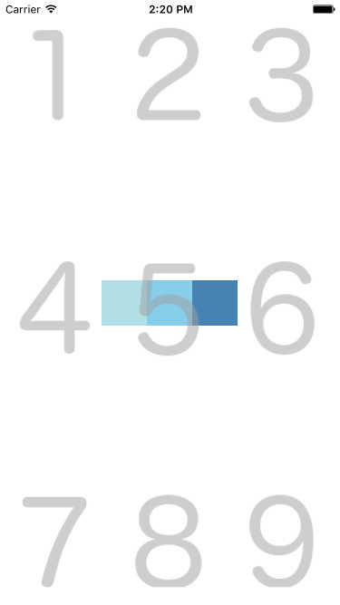
On the picture above, all items (the three blue squares) are positioned in the center of the screen because we chose dial={5}.
In addition, items are justified against the x main axis, because we used the Row component. If you want these items to stack up on top of each others, you can use the View component (y main axis):
import { View } from "react-native-row";

function Example() {
    return <View dial={5}>{items}</View>;
}
Top, right, bottom, left
While the “dial” concept is a brilliant idea, in my opinion it is still sometimes a little too abstract to grasp, so why not specifying dial numbers as plain old boring positions ?
Left Center Right
┌─────────────┐
│ TL   T   TR │ Top
│             │
│ L    C    R │ Center
│             │
│ BL   B   BR │ Bottom
└─────────────┘
Where “dial 1” is TL (Top Left), “dial 8” is B (Bottom), etc…
Why not also call a spade a spade and change the name of the View component to Col ? This would give us a library a little more comprehensive from the get-go:
function Example() {
    return (
        <>
            <Col.C>{items}</Col.C>
            <Row.R>{items}</Row.R>
        </>
    );
}
While more explicit than “dial” & View, we did not make any progress in terms of added functionality.
Directions
Now that we’re using letters to position items, we can also express directions, we’re not constrained into the realm of the 1..9 positions only anymore.
For example Row.LR could mean align items “Left to Right”:
function Example() {
    return (
        <Row.LR>
            {r}
            {g}
            {b}
        </Row.LR>
    );
}
Note
In Flexbox terms this would be equivalent to
alignItems: 'space-between'

The same way, we can express the opposite of the Row.LR component (Left Right) in a very explicit way: Row.RL (Right Left).
function Example() {
    return (
        <Row.RL>
            {r}
            {g}
            {b}
        </Row.RL>
    );
}
Note
In Flexbox terms this would be equivalent to
flexDirection: 'row-reverse'

react-native-col
react-native-col is a small library factoring all those improvements.
Key differences with sister library react-native-row are:
- Drop
dialproperty for explicit position names (above) - Drop
flex,reverse,spaceAround,spaceBetween,stretchproperties - Drop
marginandpaddingproperties
Decision behind dropping support for 2. and 3. has been made to ensure react-native-col is a property-less React component library. That way it is easier to learn and more importantly it does one thing well.
If you wish to incorporate these properties, just use the native style React Native property:
function Example() {
    return (
        <Row.LR
            style={{
                flex: 3,
                flexDirection: "row-reverse",
                margin: 30,
            }}
        />
    );
}
Note
Something along the way of
react-native-spacingcould help you replace themarginandpaddingproperties.
Drop UI librairies (Love letter to React)
If you find yourself always trying to tweak the latest “new kid on the (UI) block”, you might as well try to build your own UI component; specific to your very project.
In my humble opinion and experience, UI components share very badly, you always end up using extensively their options and/or extends their style to the point that it does not even make sense anymore comparing to building your own component with a simple single style that matches perfectly your brand and project.
Yes, you might start over on your next project but you know what? UI components are easy to build and disposable. They are so specific to your current project, so likely to change over time given very specific needs, that trying to factor everybody’s needs into one single UI library is impossible.
UI libraries fulfil the need for 80% of their users. And if your app falls into those 80%, it is a prototype, not a well polished app part of the 20% standout.
So it all depends on your needs. But I guess my point is: Don’t be afraid to build your own components, after all this is what we are paid for! Enjoy the React Native ride, learn the core library instead of learning very specific documentation about UI library X, Y or Z. You will be able to re-apply the skills on future projects and you will grow as a React Native developer! While UI library X might have died in popularity meanwhile!
I mean UI is so unimportant… Just do it with care, but move along quick. This should not be a bottleneck in your project.
Bueno, with that said and out of the way, let’s see how we can build some simple, common UI components with react-native-col.
Use case 1: Progress bar
A naive implementation of a simple progress bar with react-native-col.
// app/views/molecules/progress-bar.js

import { Row } from "react-native-col";

const HEIGHT = 40;

const $ = {
    container: {
        height: 40,
        backgroundColor: "lightgrey",
        borderRadius: 4,
    },
    bar: {
        height: 36,
        backgroundColor: "red",
        borderRadius: 4,
        padding: 6,
    },
};

export default function ProgressBar({ style, value }) {
    return (
        <Row.L style={[$.container, style]}>
            <Row.R style={[$.bar, { width: `${value}%` }]}>
                <Text>{value}%</Text>
            </Row.R>
        </Row.L>
    );
}
Use case 2: List item
The great library react-native-paper includes a useful List.Item component that falls short quite rapidly given specific design requirements.
react-native-col could help you to quickly build your own version of that component, fully customizable & adaptable to your specific UI needs from day 1.
// app/views/molecules/list-item.js

import Col, { Row } from "react-native-col";

import { Caption, Icon, Text } from "../atoms";

const $ = {
    container: {
        padding: 16,
    },
    left: {
        marginRight: 16,
    },
    content: {
        flex: 1,
        borderBottomWidth: 1,
        borderBottomColor: "grey",
    },
};

export default function ListItem({ icon, subtitle, title }) {
    return (
        <Row.L style={$.container}>
            {Boolean(icon) && <Icon name={icon} style={$.left} />}
            <Row.LR style={$.content}>
                <Col.L>
                    <Text>{title}</Text>
                    <Caption>{subtitle}</Caption>
                </Col.L>
                {!isAndroid && <Icon name="keyboard_arrow_right" />}
            </Row.LR>
        </Row.L>
    );
}
While the layout becomes rather complex, react-native-col helps keep the styles clean and concise, also giving context about elements alignment.
Conclusion
As usual no library is one fit for all, but react-native-col tries not to be in the way of building a fully custom UI for your next React Native project.
You might need a bit more time to build your own small UI components, but you will likely make up for that time in the long run, thanks to the flexibility of tuning your UI to the pixel.
Happy coding.
If you enjoyed this article, give it a clap on Medium.